Joyce Here!
I’m a Showit web designer who helps service providers ditch the ick and step up with a website that locks in their audience and builds a legacy that lasts.
free notion workbook
Website Game Plan
This Workbook puts everything—branding, copy, and site structure—in one place, so you can plan your website like a pro and launch with clarity and confidence.
get it here
Make These 6 Quick Tweaks To Your Website To Land High-Paying Clients
If you’re reading this, it’s very likely DIYed your website. Chances are, if you’re not a web designer, you may have missed a few things that are preventing you from landing high-paying clients.
You might not really care for the “expensive look” for your website, and you really don’t need to. Today we’re talking about making sure you have a cohesive and professional looking website build. Here’s why I think you should care:
According to the Google, it takes a person around 0.05 seconds to make an impression about your website and less than 5 seconds to form an opinion about it.
Having a website PERIOD shows your potential clients that YOU are the real deal.
It means you’ve dedicated enough time to present this digital “resume” showing them just how legit you really are.
(even if this is currently just a side hustle for now)
Making your website LOOK the part, gives you the chance to charge your clients what you want to make and what you’re actually worth.
A sloppy website can make you lose out on some really valuable clients as soon as they open your website.
Remember, we have less than 5 seconds to convince these people to consider giving you their money!
momma wasn’t lying when she said time = money!
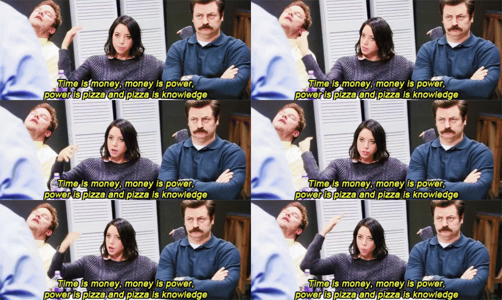
Here’s a list of a few ways you can make your website look 10x more expensive to turn your inquiries into paying clients:
1. Lead them to your actual website
I’ll be the first to admit – I don’t really fuck with 3rd party link services like: Canva, Stan.store, Milkshake, or Linktree (etc.) – for the link in your bio.
Hear me out –
I understand the amazing things these platforms can offer and the convenience of how accessible they are to some users.
Sometimes, it’s all that fits the budget, right? Trust me, I get it.
But here’s why I think website tweaks (like linking to your direct website in your bio) can help land those high-paying clients:
That Google Visibility is Weak AF 😞
Using third-party link services can tank your SEO and website stats because all the traffic is going to their platform, not yours.
When people click on your Linktree or Stan.store, you’re missing out on valuable clicks and pageviews that would’ve boosted your website’s visibility.
Plus, your domain won’t rank as high on Google since search engines aren’t seeing that juicy traffic flow to YOUR site. It’s like giving away your spotlight to someone else!
It’s Off-Brand Vibes:
Let’s be real—when someone clicks on a Linktree or Stan.store, they’re seeing someone else’s branding, not yours. Your brand should be front and center, not lost on a generic page.
You’ve spent time (and probably money) crafting your brand’s look and feel, so why throw that away by using a basic template that everyone else is rocking? Your link-in-bio should reflect your energy and vibe, not blend in.
I’m not saying basic = bad, but you can’t tell me there’s anything original about this –
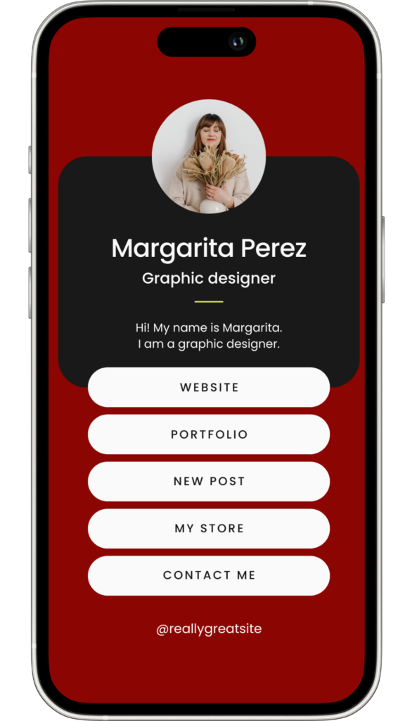
Design Flexibility is Trash:
With your own website, you can design that link-in-bio to match your aesthetic and control every pixel. These platforms limit your creativity, which makes your whole online presence look a little meh.
Just note: these third-party links can also reduce the control you have over the user experience, leading potential clients to question the value of your offerings.
Soooooooo…what should I do???
Create a branded landing page on your own website that acts as a hub for all the links you want to share.
This page should feature your brand’s design elements, including your logo, color scheme, and fonts, and can include links to your services, social media, blog, or any other important resources.
Keep it visually appealing and easy to navigate with minimal options so you don’t overwhelm your visitors.
Remember – this is just a mini me of your website

I actually have found this silly little link in bio page to get neglected A LOT! That’s why I made this free website template on Showit to get you started with your very own, not-so-generic, link in bio landing page.
It’s all decked out and ready for you to customize it to match your unique vibe and make your website look like the real mf deal.
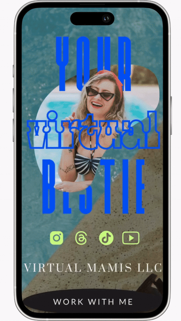
All you gotta do is plug 🔌 and play 🛝
So, if you’re stuck and ready to cut the middle man out to direct your leads directly to you, bestie, this is exactly what you need!
We all already know just how crucial our social media is to getting some visibility for our business.
Why not get started on the right foot from the get-go?!
2. Check your text alignment
Misaligned text, inconsistent spacing, or centering large blocks of text can make your website look disorganized and messy.
When it comes to aligning text on your website, the general rule is to stick with left or justified alignment for body text.
It’s easier on the eyes, especially for long paragraphs, and helps the flow feel natural—like how we read a book or scroll a timeline.
I’m no hater to designing outside the box (y’all know me), BUT there’s a good chunk of guidelines we should continue to stick to.
Centering your text might look cute in small doses (like headers or a cta), but too much can make it feel like you’re reading a riddle, and nobody has time for that.
Right alignment…unless you’re using Arabic, Hebrew, and Persian alphabets, you should definitely stay away from this alignment like the plague!
Cuz ya know, we have less than 5 seconds???
Left and justified aligning keeps your site clean, easy to read, and less distracting.
It also helps guide your readers through your content without making them work for it. Simple, stylish, and straight to the point—just like your brand!.
Why?
Readability on our website is crucial!! Our reader’s attention span is short, and they need to be hooked from start to finish.
(obvs this includes some bomb ass copy, but I’m talking about design today)
Proper text alignment and consistent spacing give your website a clean, polished look that feels deliberate and professional.
This simple adjustment can significantly enhance the overall readability and aesthetics of your site, making it look custom-designed and more expensive, which supports your ability to charge higher rates.
And ya know, splurge on that.
3. Check your color combos
Speaking of readability, we can’t just focus on the words. You need to pay attention to the colors you use.
I love the use of fun colors and being bold. Just remember that some colors don’t contrast well and make it hard to see.
Using colors that don’t contrast enough, like light gray text on a white background, can make your content difficult to read. This not only creates a poor user experience but also makes your site less accessible to people with visual impairments, ultimately cheapening your brand and limiting your audience.
My favorite tool is the color palette builder – a simple, easy online tool that helps you check your brand colors for usability, contrast, and harmony in seconds 🎨
OR this FREE color contrast checker
Use these tools to test and adjust your color combinations if needed.
Make sure that your text contrasts strongly against the background—typically, this means using darker text on a lighter background or vice versa.
4. Custom brand photography
I can’t tell you how much of a difference it makes to have professional photos of you on your website.
These don’t even need to be just a bunch of headshot photos. Make them you, fun, and on brand. Your pictures that match your brand vibe and colors wraps the whole thing up together.
If the budget is tight, you can ask some friends if they know any photographers. I’ve always known someone to know someone who loves taking pictures, but probably doesn’t do this full-time and can likely give you the hook-up.
If you don’t have a photographer plug that can hook you up with an affordable photoshoot, do this to help your website photoshoot look dare I say, better than the mirror selfies and random family pics :
- Hit up your sister for a DIY photoshoot session
- Find a place near you that goes with your vibe to take some pics (or your home if your home decor matches your brand)
- Use pinterest to brainstorm some ideas on the vision of the pictures, location, outfits, and poses!
- Use whoever’s phone is newer for the pics
- Look up on TikTok or YouTube how to set up your phone camera settings for some high quality pics
- GETTER DONE!
Stock photography is fine to fill in the gaps, but your dream client wants to see YOU.
Buuuuuut, just not your selfies all over your website 🤧
5. High-resolution images
Using low-resolution, poorly lit, or (too many) generic stock images can make your website look unprofessional and cheap 🤐
It signals a lack of attention to detail and can make potential clients question your ability to deliver high-quality work (even if it has nothing to do with design).
Try sticking to high-resolution images that are aligned with your brand’s aesthetic. If professional photography isn’t in the budget, choose premium stock photos that have a cohesive look, feel, and color palette.
Also, make sure your images are properly optimized for web use to avoid slow load times. This free image optimizer is my favorite tool to get that done!
6. Add movement
Shake it up a little bit! Allow me to explain:
The human eye is naturally drawn to movement.
A little bit of movement can create a more dynamic and interactive experience, which encourages users to explore and spend more time on your site.
It keeps them engaged by breaking up the repetitiveness of static content and providing visual stimulation.
Engaged users are more likely to interact with your site, absorb your content, and ultimately take the desired action, whether that’s signing up for a newsletter, making a purchase, or booking your services.
9 Examples of how you can add movement to your website today:
- Add some gifs (be careful with this one since they can slow down your website sometimes)
- Typewriter text effect
- Marquee scrolling text effect
- Rotating texts
- Flashing words
- Photo gallery on auto advance
- Video background instead of image
- Mess around with the canvas types (Parallax, Fixed, or Scroll w page)
- Transition effects on text (fade or slide [up] being my fave)
Dynamic media, elements, and sections naturally grab readers attention right away and sets the tone for a premium experience, making your site feel custom-built and high-value from the very first glance.
(cuz ya know, we only have 0.05 seconds to make an impression)
Y’all know me, I love saving a buck anywhere I can!
If you decided to DIY your website (and you’re not a web designer), you may have missed a couple of these little details that make a world of a difference.
If making the necessary website tweaks to land high-paying clients feels too overwhelming to do yourself, you might be interested in:
- A website template that already includes all the features mentioned above…and then some
- Not to toot my own horn, but these templates are no joke! A professionally designed Showit website template for the fraction of the price.
- A customized website template done for you (📢 IN JUST ONE DAY 📢), or
- A customized website designed JUST FOR YOU!
I’m Joyce, a Latina Showit web designer who goes feral for collabing with service providers to step into their main character energy online.
Think of me as your internet big sister, here to hype you up, steer you away from bad design choices, and make sure your website does you justice. Whether we’re going full custom or making a template look sexy af, I’ve got you—because no little sister of mine is walking around with a mid-ass website.
The tech bros hate to see me coming
Left brain web wiz turning the internet into girl world
about me
ghoul world
For service providers who want to launch fast and flawlessly, these strategic, easy-to-use Showit templates help you show up hot af online and shave off a couple dollars without sacrificing the final results.
DIY, But Make It Easy
Showit Website Templates
help me diy my website
A website that fits your business and makes a lasting impression
Your website should fit your business—not the other way around. The right site makes it easier to show up, stand out, and grow on your terms. Because this isn’t just about getting online.
It’s about building something that keeps up, so when you’re ready for your next move, your website is too.
impression
Whether you're looking to launch your first website or upgrade your current site, I'll take it off your plate completely and build you a beaut to make booking your services easy af while you focus on literally anything else!
DFY Website design
Showit Web Design for Service Pros
i'm ready to be spoiled!
she's waiting for ya
Most websites flop because they’re thrown together without a plan. The design is just the icing on the cake, before you get there, you need to lock in:
✔️ Your brand’s foundation—mission, values, offers, and messaging
✔️ The words that sell—target audience, keywords, and copy prep
✔️ A brand that clicks—visual identity built from strategy, not vibes
✔️ A website plan that makes sense—what pages you need and why

